Seeger – Where Heritage Meets Modernity
UI/UX Design for a historic culinary landmark in St. Gallen, Switzerland.
My Role
UX/ UI Designer
Modernizing a century-old digital presence without alienating a loyal, traditional clientele.
The problem
The solution
A balanced, "quiet luxury" UI that honors the restaurant's history through classic typography and modern layout structures. https://www.seeger.ch
Keywords
Gastronomy, Heritage, Minimalist UI, Editorial Layout.
Seeger is a culinary landmark in St. Gallen with over 100 years of history. The challenge was to bridge this rich heritage with a contemporary digital presence. The result is a minimalist UI that balances deep forest greens with a sophisticated typographic hierarchy, reflecting both the tradition of the space and the freshness of its modern cuisine.
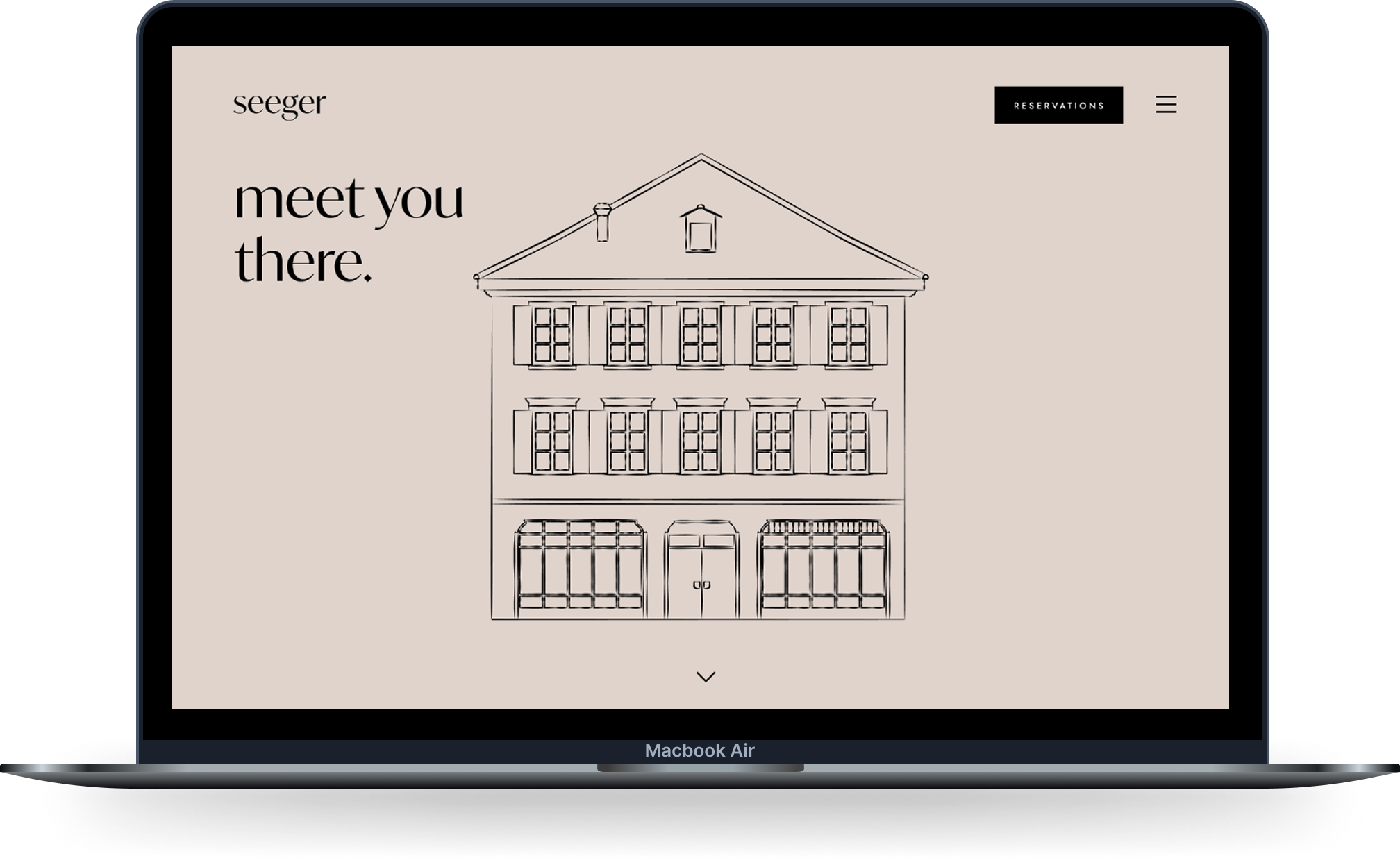
The visual identity plays with the concept of 'The past meets the present.' I paired a high-contrast serif for a classic, editorial feel with a clean sans-serif for functional readability. Linear architectural illustrations were integrated to honor the iconic building, creating a cohesive link between the physical location and the digital experience.
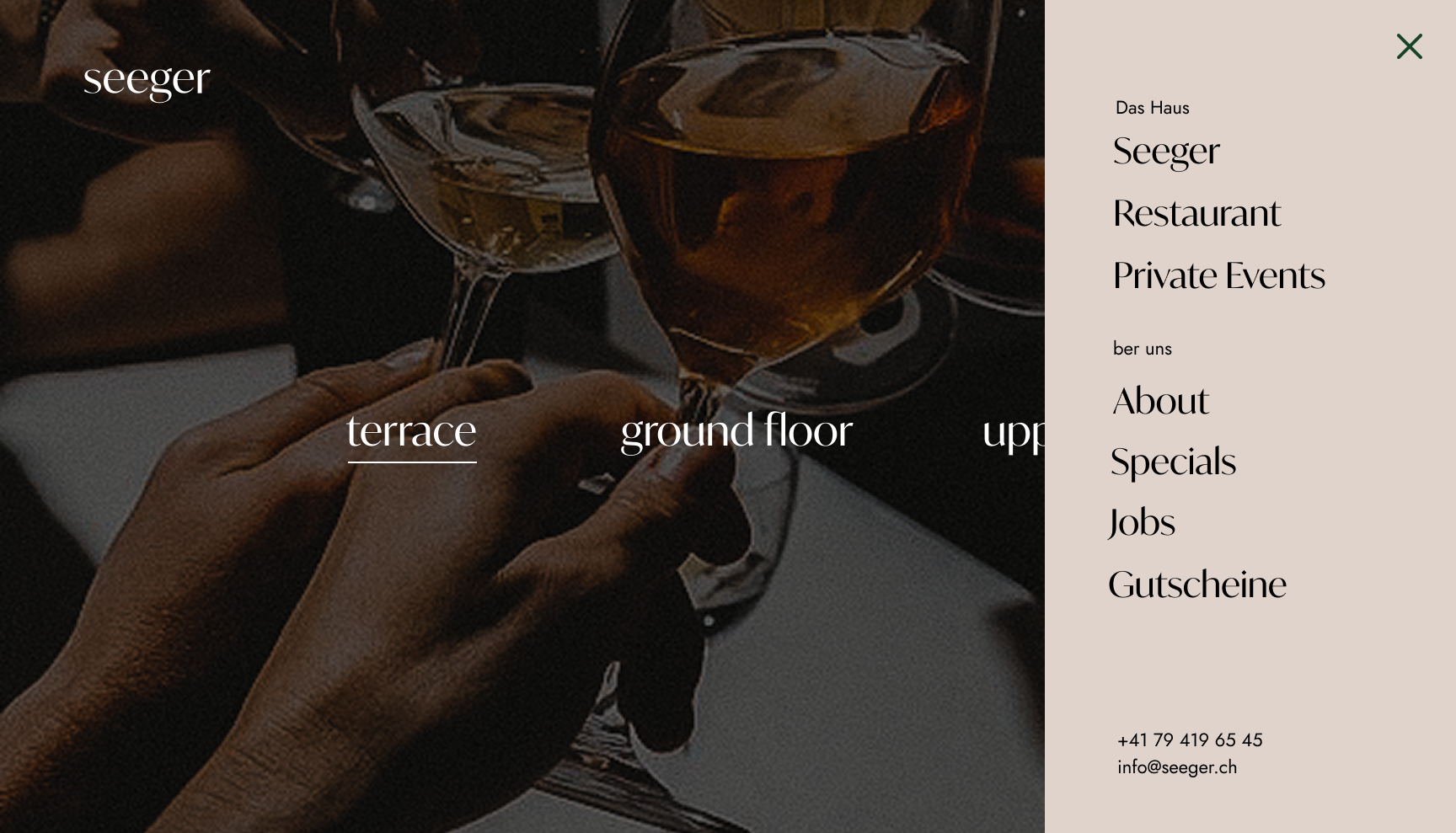
Navigation & Mobile Accessibility
The off-canvas navigation provides a seamless transition on mobile and desktop, keeping the interface uncluttered. The menu is intuitively categorized to allow quick access to essential sections like 'Restaurant', 'Events', and 'Gutscheine' (Vouchers).
Immersive Dining Experience
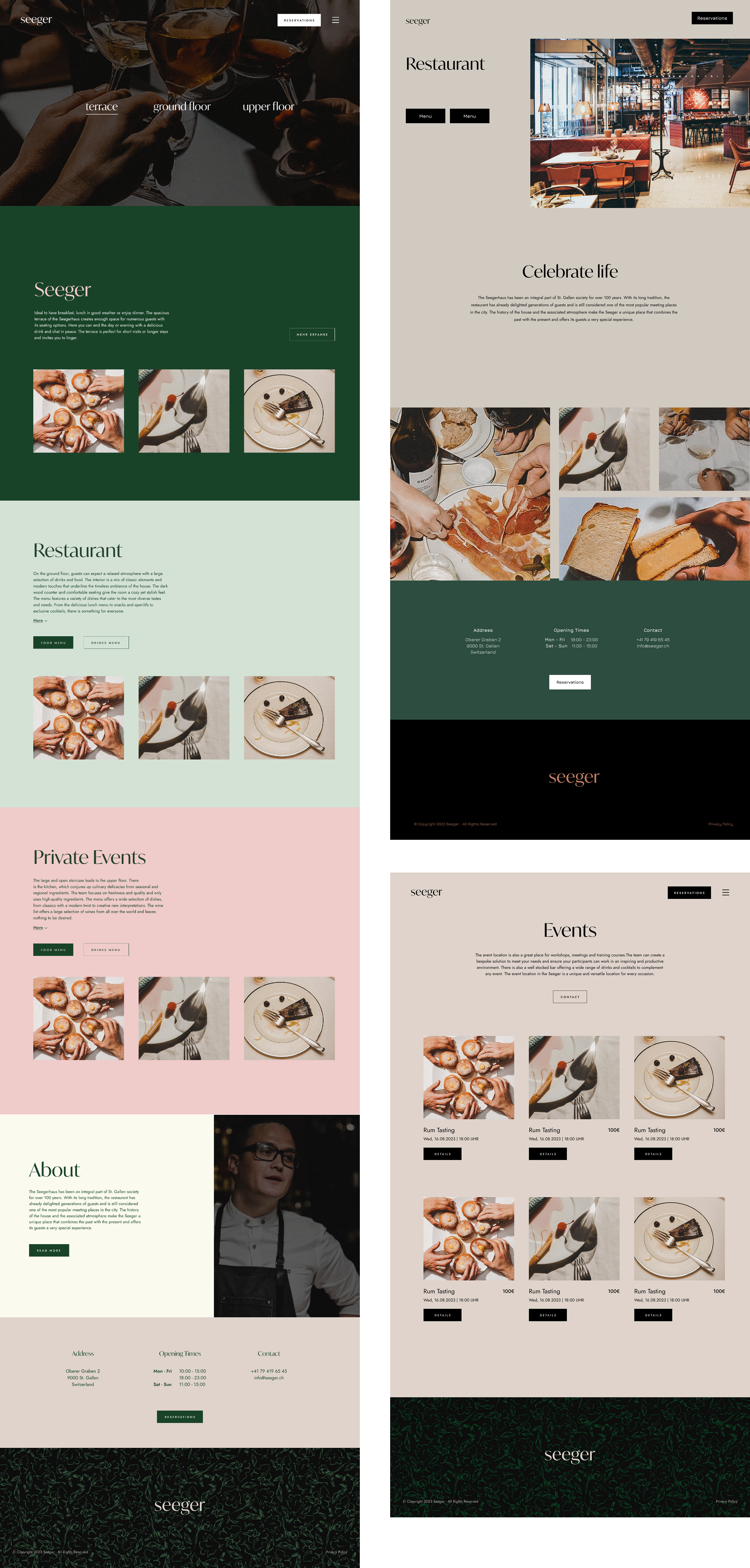
The information architecture was designed to be intuitive yet atmospheric. On desktop, high-quality photography takes center stage to create immediate visual desire. The 'Reservations' and 'Menu' calls-to-action are strategically placed to ensure a seamless conversion flow, allowing the user to transition from browsing to booking effortlessly.
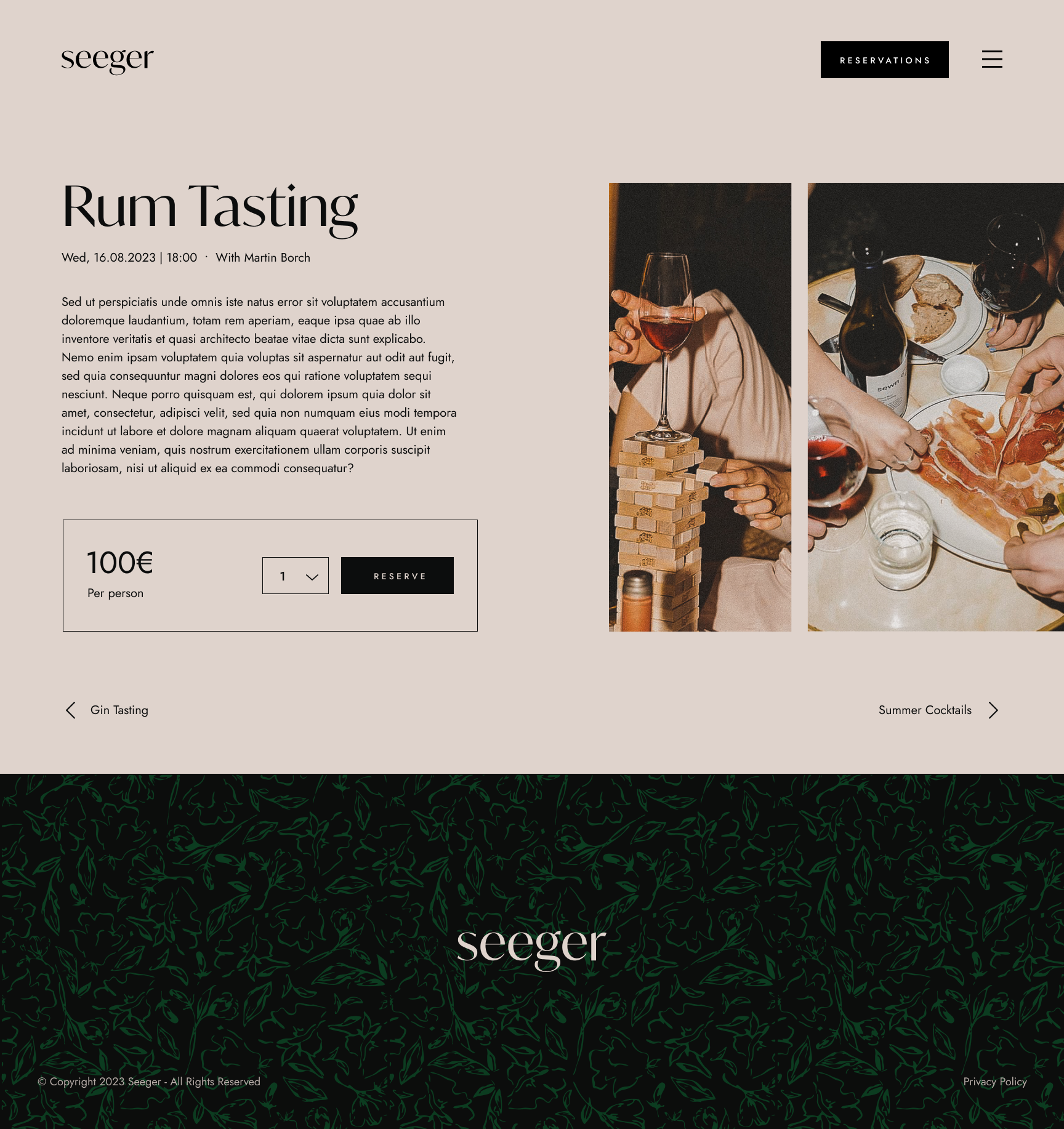
For the events and specials, I developed a modular grid system. This ensures a clean, structured presentation of information—such as dates and pricing—while allowing the brand to scale its offerings effortlessly without compromising the premium layout.
Focused Conversion Flow
The booking interface was designed to reduce cognitive load. By utilizing generous white space and a focused 'call-to-action' area, the design guides the user through the reservation process with zero distractions, maintaining a sense of exclusivity throughout the journey.