
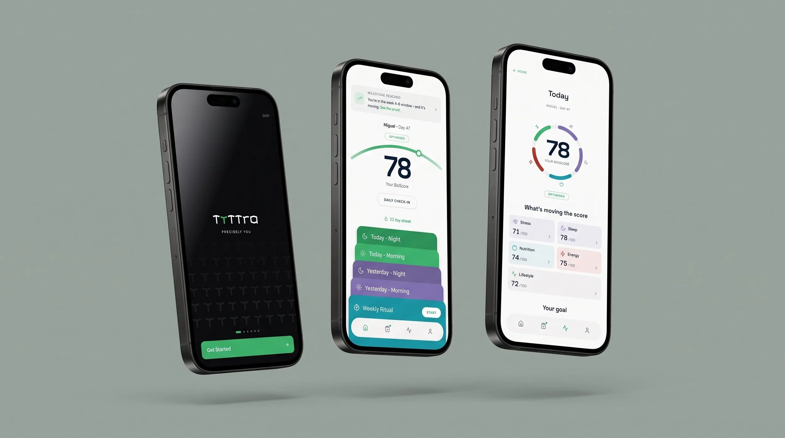
Tyttra - A personalised supplement app that builds a protocol from a 4-minute quiz.
My Role
I turned the product manager's PRD into an initial user flow, built a functional prototype with Claude Design and mapped the complete experience in FigJam. Every screen and use case is connected, in the order of the PRD's Jobs to be Done and work packages.
Credits & Info
Client project developed at Untile, with a lead designer, a product manager and the development team, who reviewed the flows together. The client followed the process and validated each stage. Tyttra is available on the App Store. Tools: Claude Design and FigJam.
A supplement plan people can trust
Tyttra builds a personalised protocol from a short quiz and wearable data, then delivers it in daily sachets.
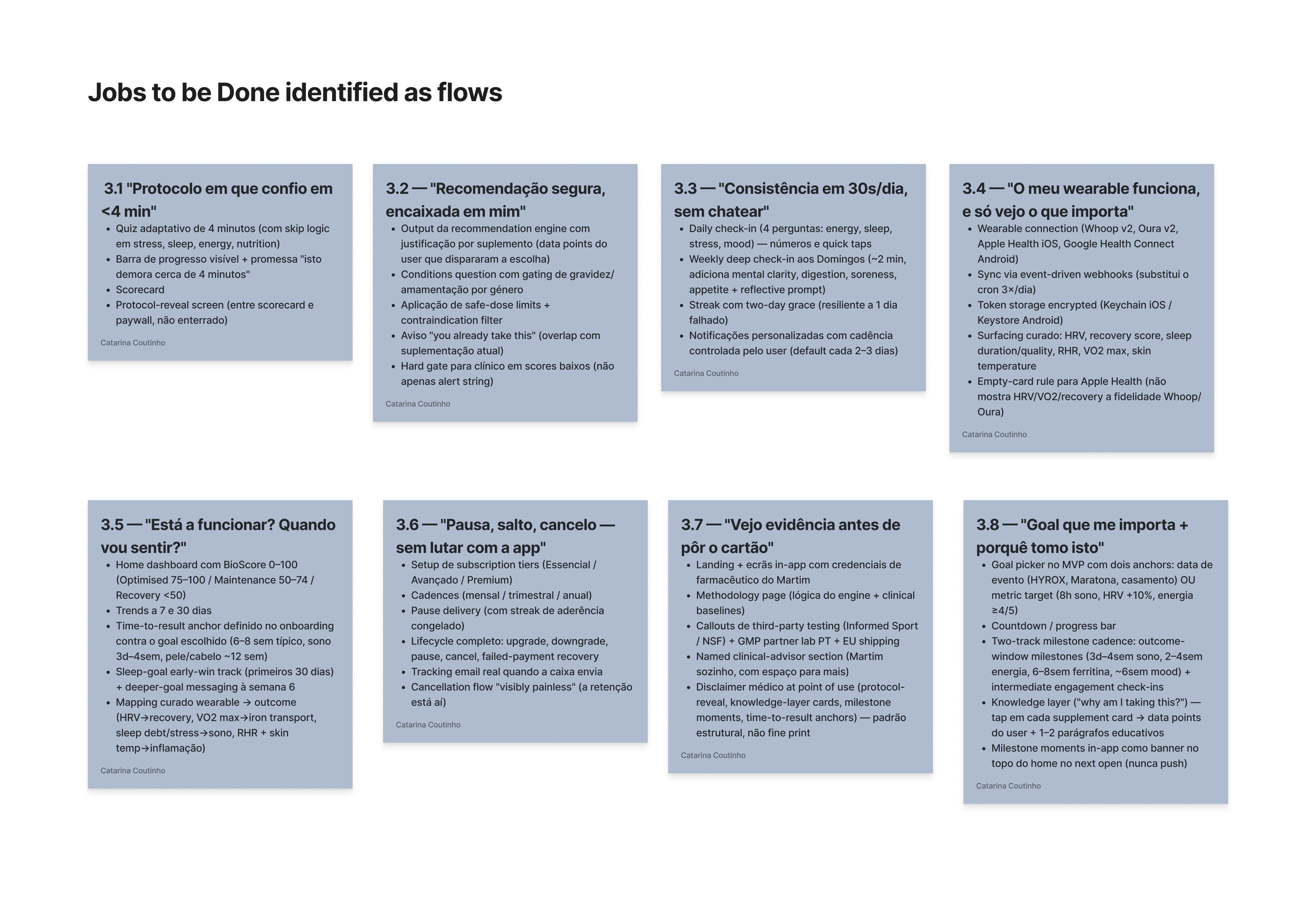
The PRD described the product through eight Jobs to be Done. Each one is a promise in the user's words: a protocol I trust in under four minutes, a safe recommendation, consistency in 30 seconds a day, and the freedom to pause or cancel without fighting the app.
From a PRD to a map of every screen
I started with words: the PRD's jobs became an initial user flow, with the entry points, decisions and screens each job needed. Then I built a functional prototype in Claude Design to test the flows as a working app.
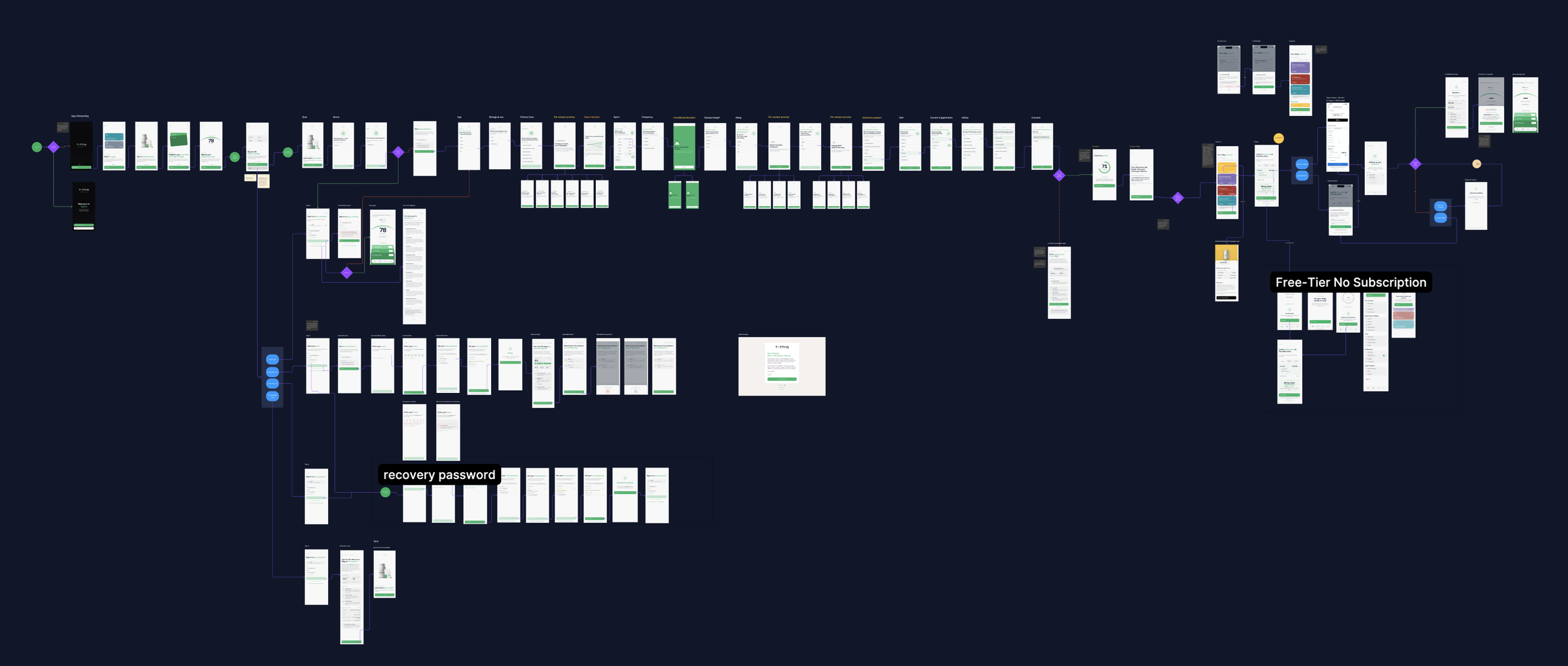
The last step was the complete map in FigJam. I took a screenshot of every prototype screen and connected them with arrows, grouped by work package: onboarding, daily loop, wearables, subscription, trust and retention. Each group starts with a user goal, such as "User wants to pause their subscription".
The map became the reference the lead designer, the PM, the developers and the client used to review and validate each flow.
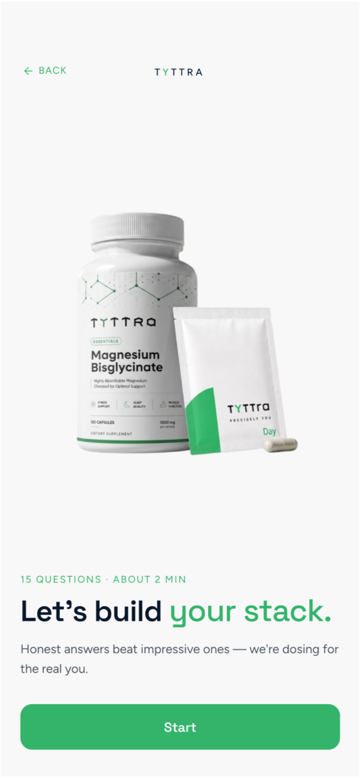
A protocol in under four minutes
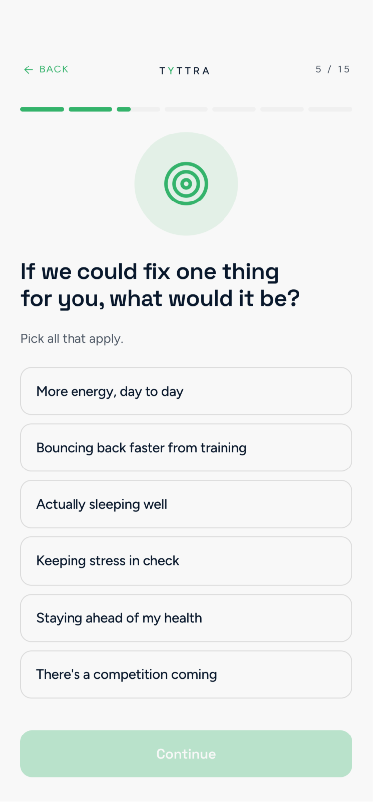
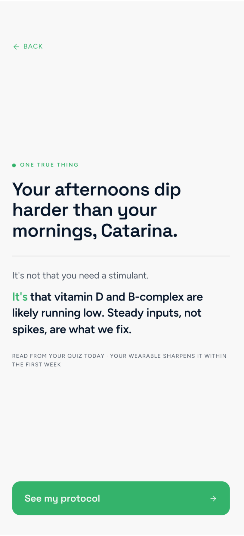
The quiz opens with a promise: this takes about four minutes. A progress bar keeps that promise visible, and skip logic adapts the questions on sleep, stress, energy and nutrition to each answer.
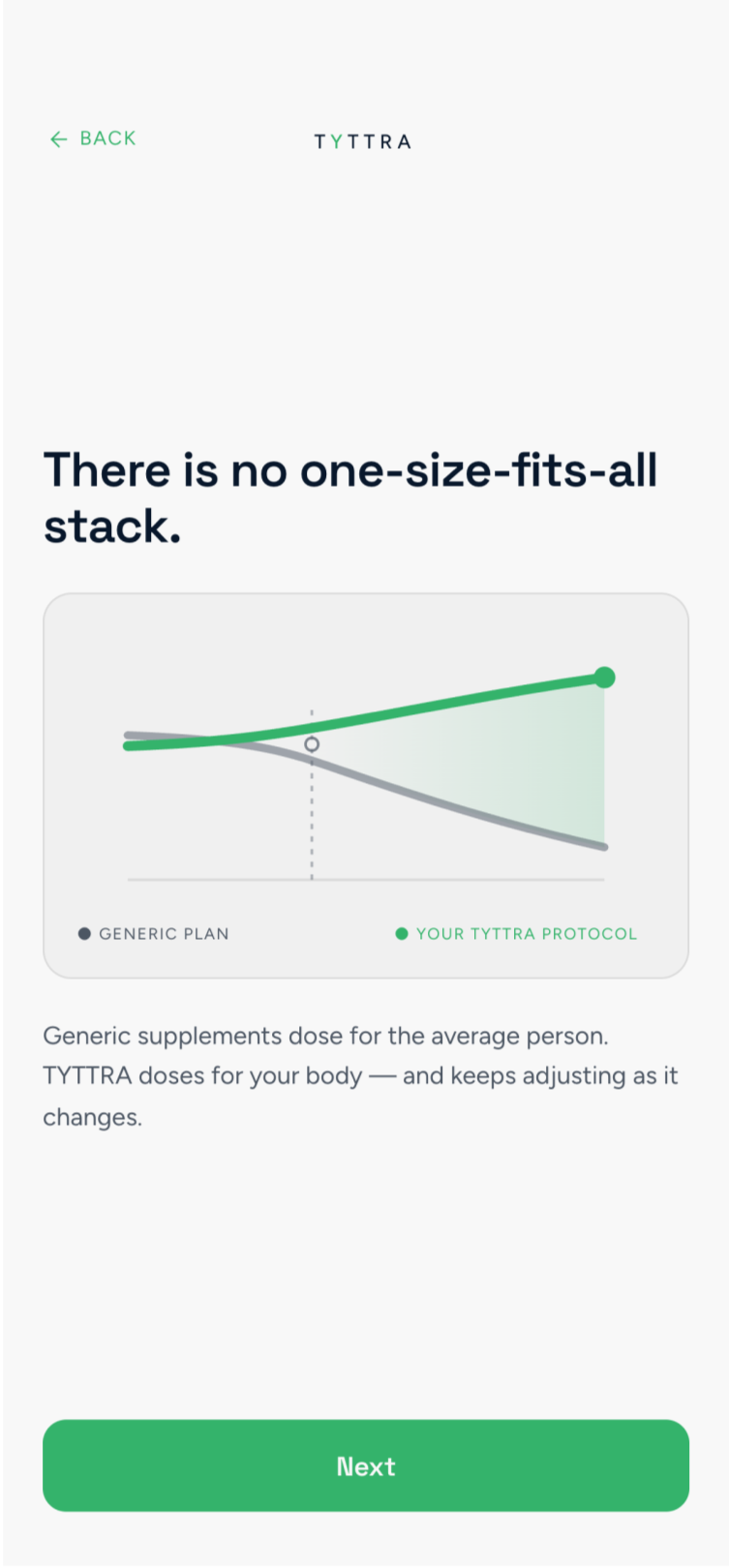
The questions move from the person to the routine: name, age, primary goal, sport, training frequency, sleep, diet and current supplements. Short "per answer promise" screens and a value interlude explain why each answer matters.
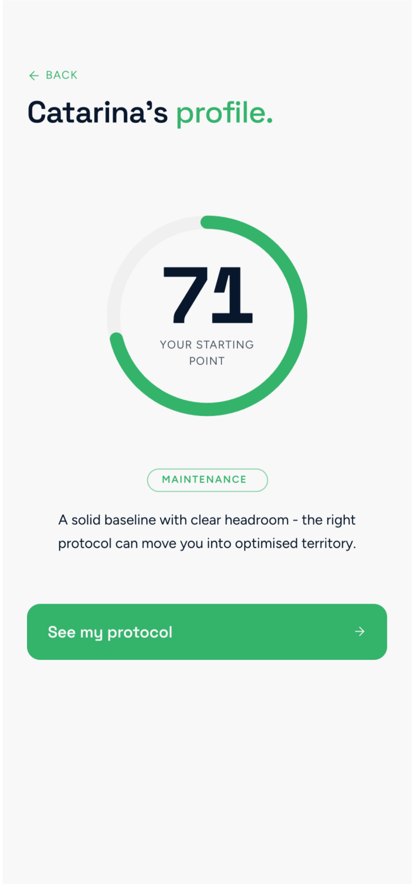
The quiz ends with a scorecard, one key insight and the protocol reveal, all before the pricing screen. Users see what they get and why before they pay.
Safety is part of the flow
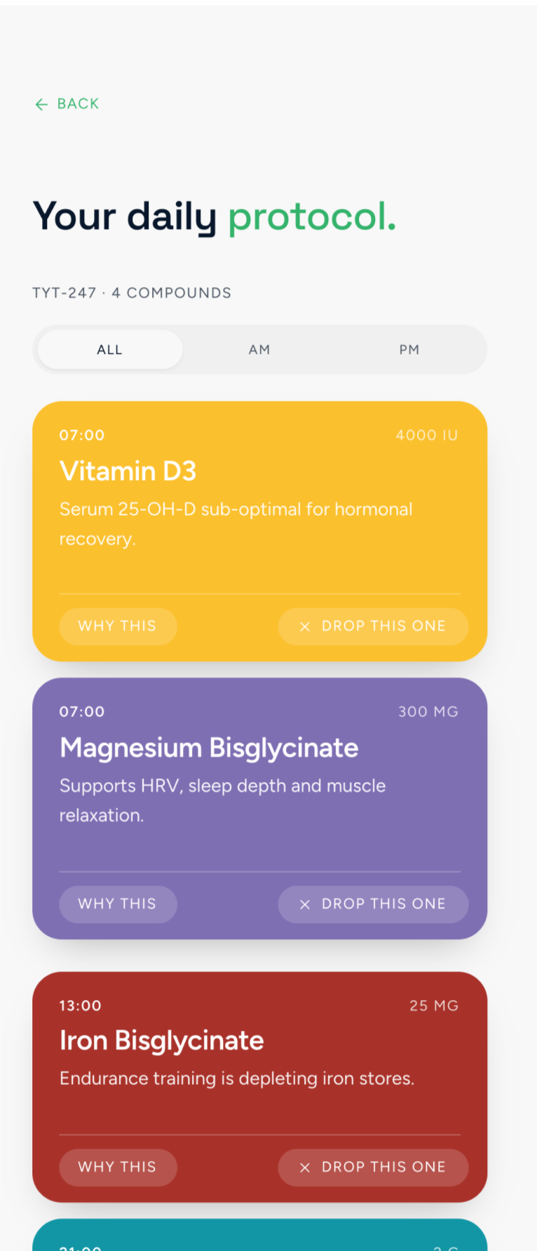
A supplement app has to know when to say no. The quiz asks about conditions and current supplements, and the protocol warns users when they already take something it recommends.
When the answers show the user shouldn't take the supplements, the flow stops at a consultation screen instead of a warning they can dismiss. The medical disclaimer sits at the point of use, on the protocol, the supplement details and the milestones, as part of the design rather than fine print.
A routine that fits in 30 seconds
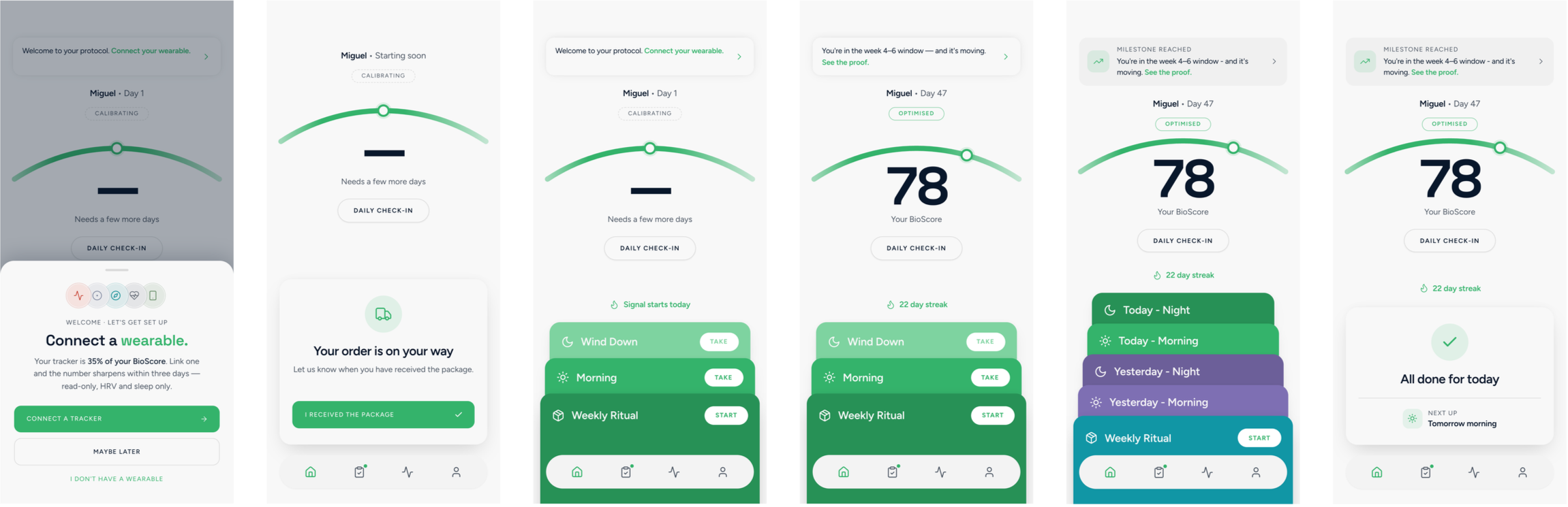
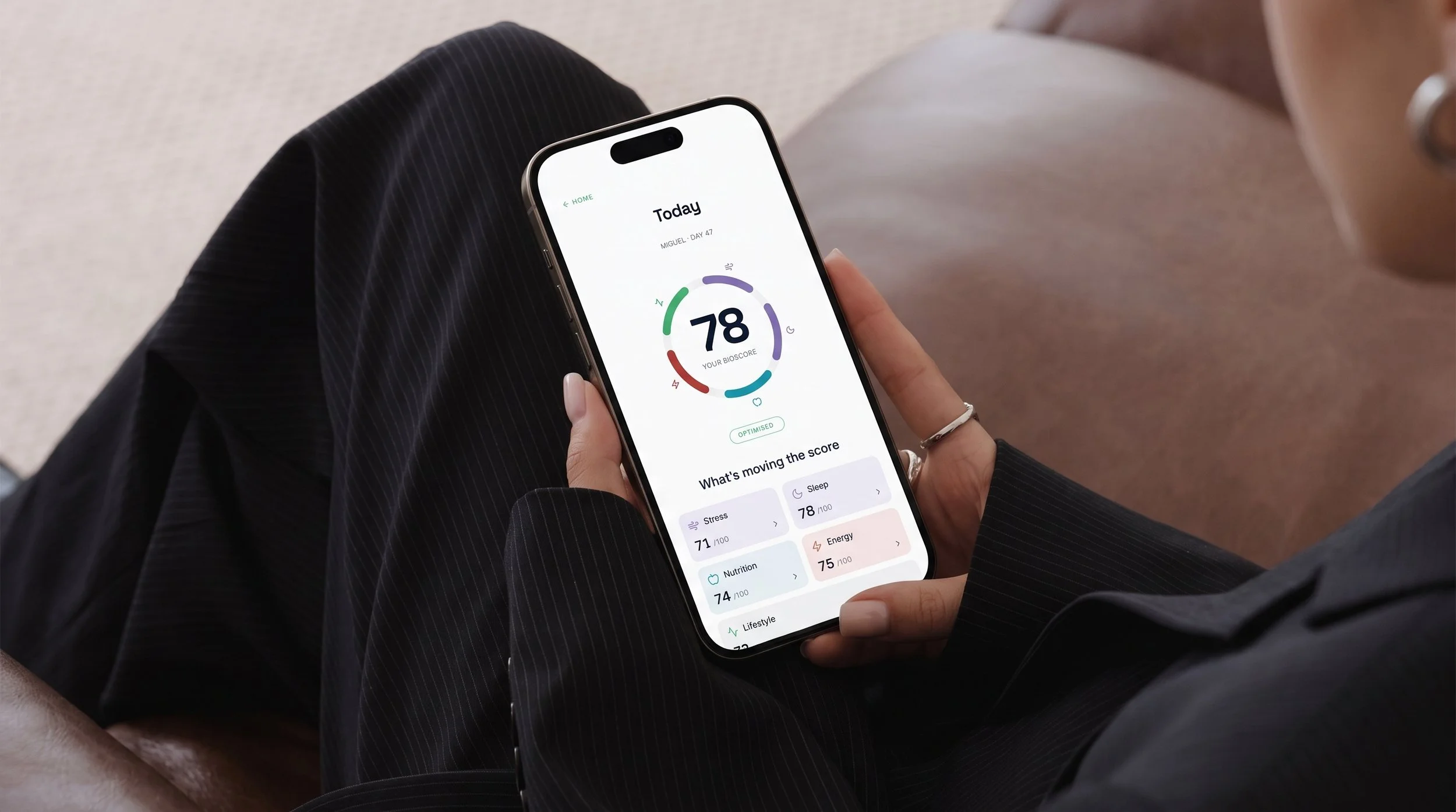
After onboarding, the home screen holds the daily routine: today's sachets, the BioScore and the adherence streak. I designed it in six states, from an empty home and day one to day 47 and "intake done".
Marking the first sachet as taken unlocks a 30-second check-in: four quick taps on energy, sleep, stress and mood. On Sundays, a two-minute weekly check-in adds digestion, mental clarity, soreness, appetite and a short reflection. Once a week, a guided flow helps users prepare their sachets.
The streak allows two days of grace, so one missed day doesn't break it.
One tap to log a sachet
The home screen shows today's sachets. Users mark a sachet as taken with a single tap, and the first intake unlocks the daily check-in.
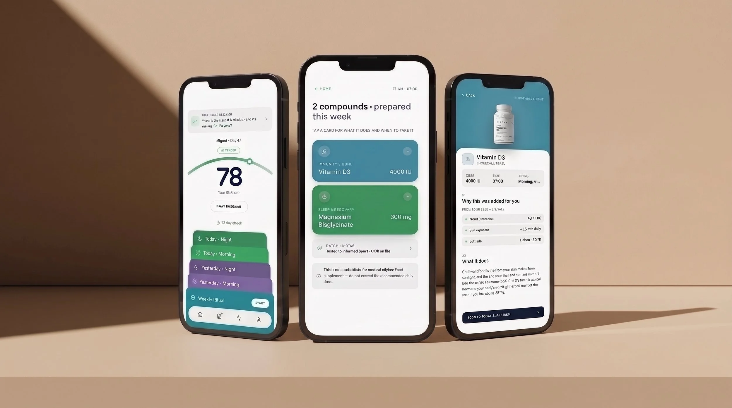
Each sachet opens to the supplements inside it, and each supplement opens to a detail screen that answers "why am I taking this?", with the user's own data points and the medical disclaimer.
Push notifications remind users at their intake times, in the morning and at night, and again after three days without a log.
One score that answers "is it working?"
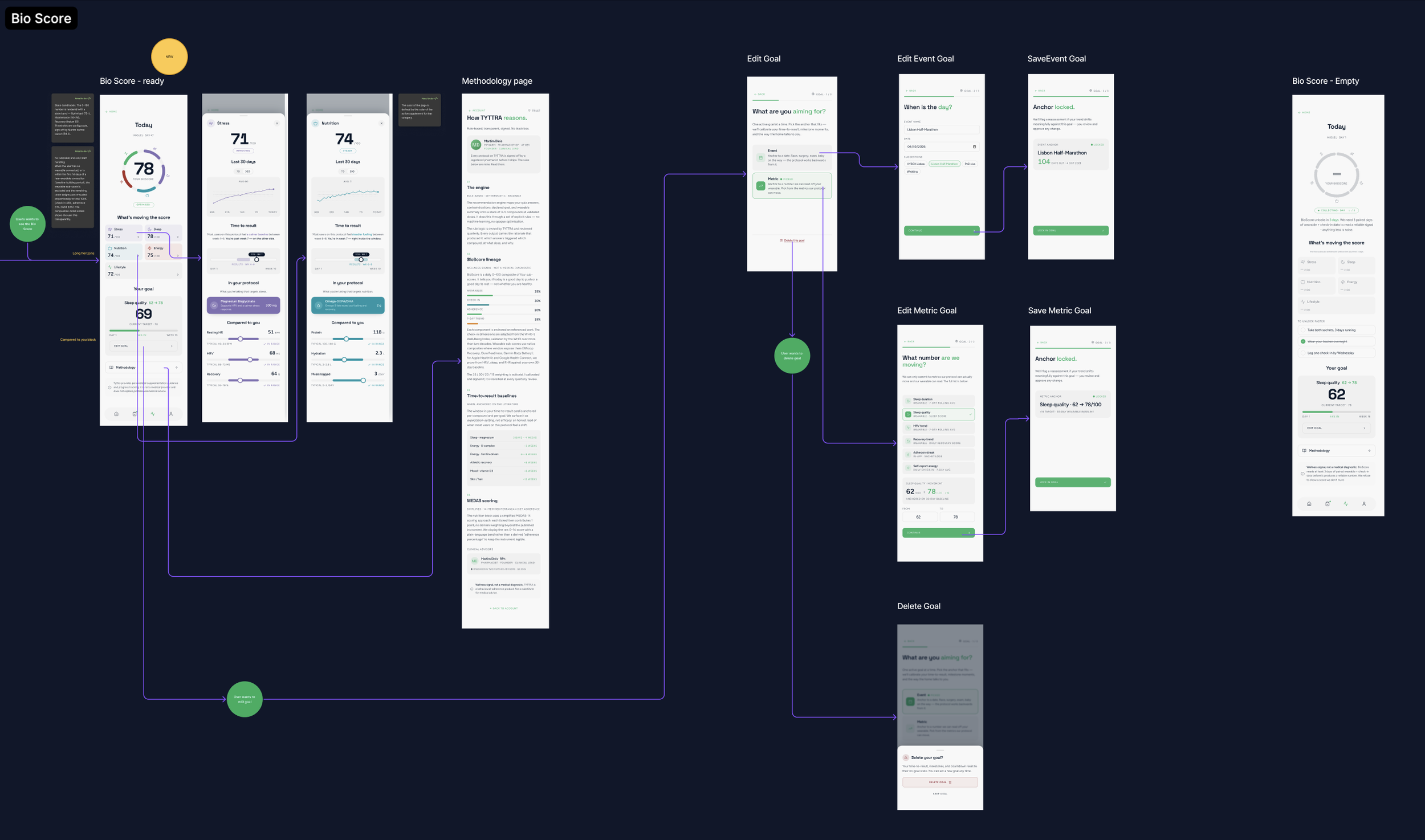
The BioScore turns the daily data into one number from 0 to 100: Optimised from 75, Maintenance from 50, Recovery below that. Wearables connect through Whoop, Oura, Apple Health and Google Health Connect. Users set a goal, either an event date or a metric target, and a time-to-result anchor set during onboarding answers "when will I feel it?".
Milestones at weeks 1, 3, 6 and 12 appear as a banner on the home screen the next time users open the app, never as a push notification. Week 6 has two versions: one for a visible win and one for when results haven't shown yet.
Leaving should be as easy as joining
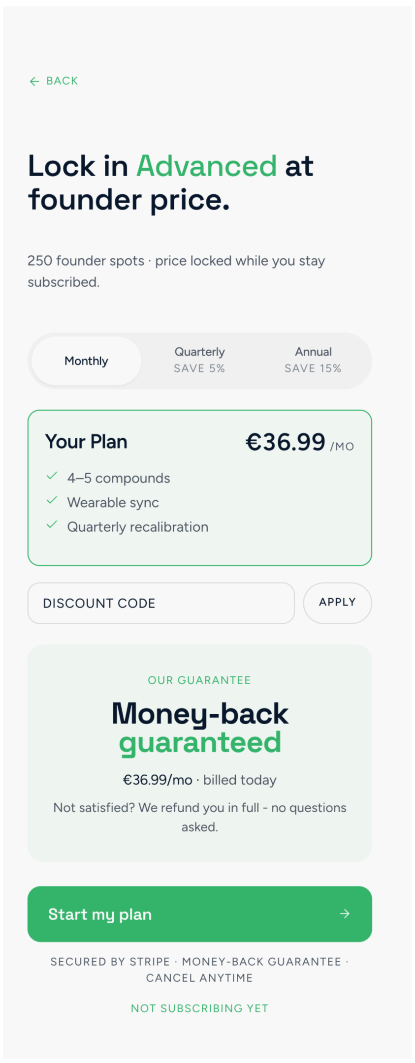
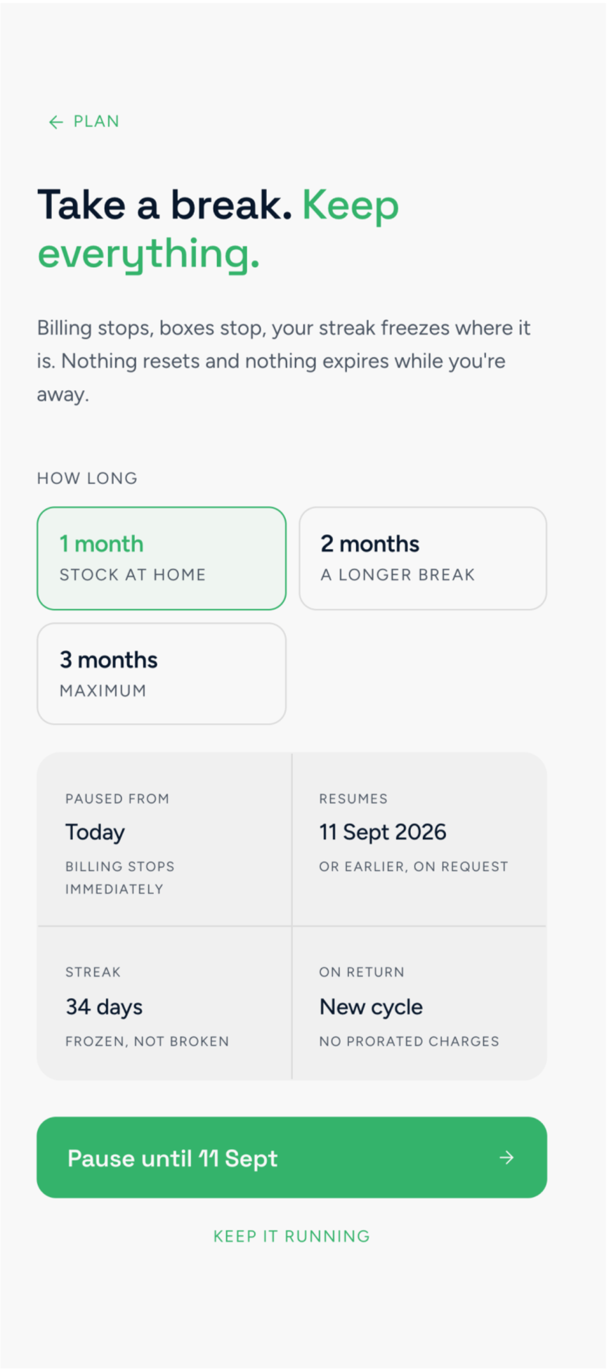
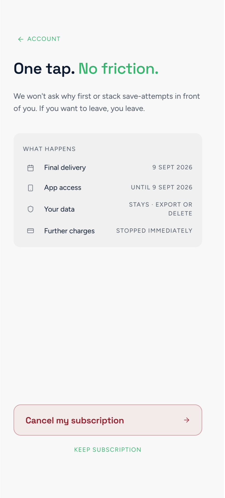
Tyttra offers three tiers (Essential, Advanced and Premium) on monthly, quarterly or annual plans. I mapped the whole lifecycle: checkout, plan changes, pause, cancellation and a refund in the first 15 days. Pausing a delivery freezes the adherence streak, so a break doesn't cost the user their progress.
Each subscription state has its own profile card and plan-change screens: active, cancelling, payment failed, lapsed, ended, pending and paused.
Designing the paths nobody plans for
The happy path is only part of the map. I designed what happens when a payment fails or stays pending, when a code is wrong or expired, and when too many attempts lock an account. Each error leads somewhere, with a retry, a resend with a cooldown timer or a way to contact support.
What I learned
Draft lessons, to confirm or replace. The prototype showed how each screen worked. The map showed how they all fit together.
Prototype first, then map
A working prototype gave the map real screens to connect.
One map for everyone
The lead designer, the PM, the developers and the client reviewed the same board.
The edge cases are the product
Failed payments, wrong codes and paused plans needed as much design as the happy path.