
UFlow – A brand identity for an AI tool that turns functional prototypes into User Flows, created with AI.

My Role
I created the brand strategy, verbal identity and visual identity, and directed every AI output. The final design decisions were mine.
Credits & Info
Academic project for the Design and Branding with AI module of the Postgraduate in AI for Design at IADE, taught by Filipe SJ. UFlow is a brand concept. AI tools: Claude, ChatGPT, Gemini and Google Flow.
Designers still draw the arrows by hand
Once a functional prototype is ready, designers find every path, screenshot each screen and connect them with arrows in FigJam. It takes time away from interviews, usability tests and design decisions.
UFlow is a concept for a tool that does this step automatically. It turns a prototype into a structured User Flow, with every screen in place.
Strategy came before any image
I started with words: a strategic brief and a voice manual. The brand speaks like a competent colleague, not a salesperson. Its archetype is the Sage, who explains what a prototype does, with a held-back Magician: transformation you can see on a screen, never "magic".
Every image prompt I wrote later started from these decisions.
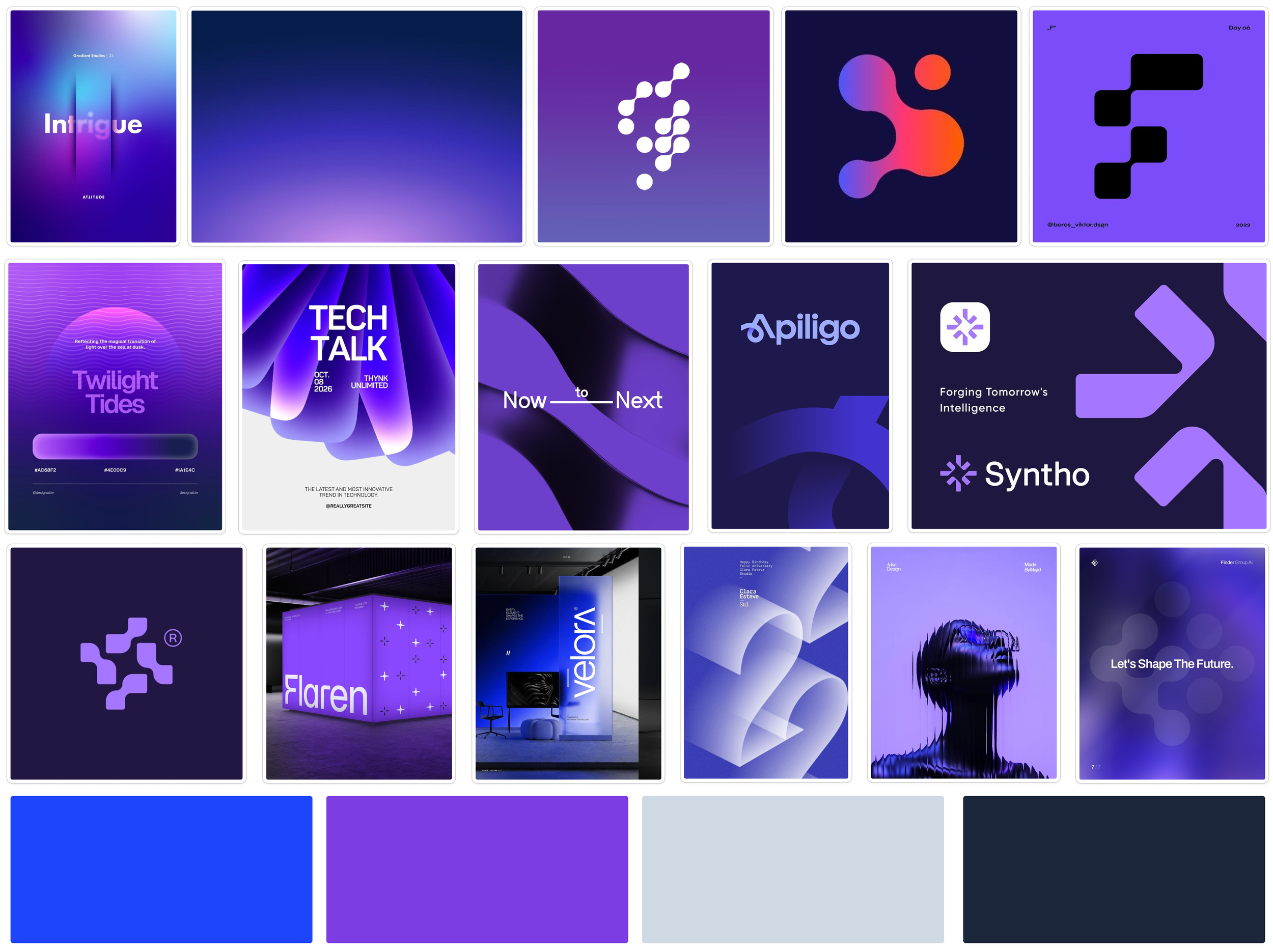
A moodboard to set the direction
Deep navy, electric blue and violet. Linked nodes, bold geometric type and soft-grain gradients. I left out lifestyle photography, literal flowcharts and generic AI imagery, which pulled away from a B2B design tool.
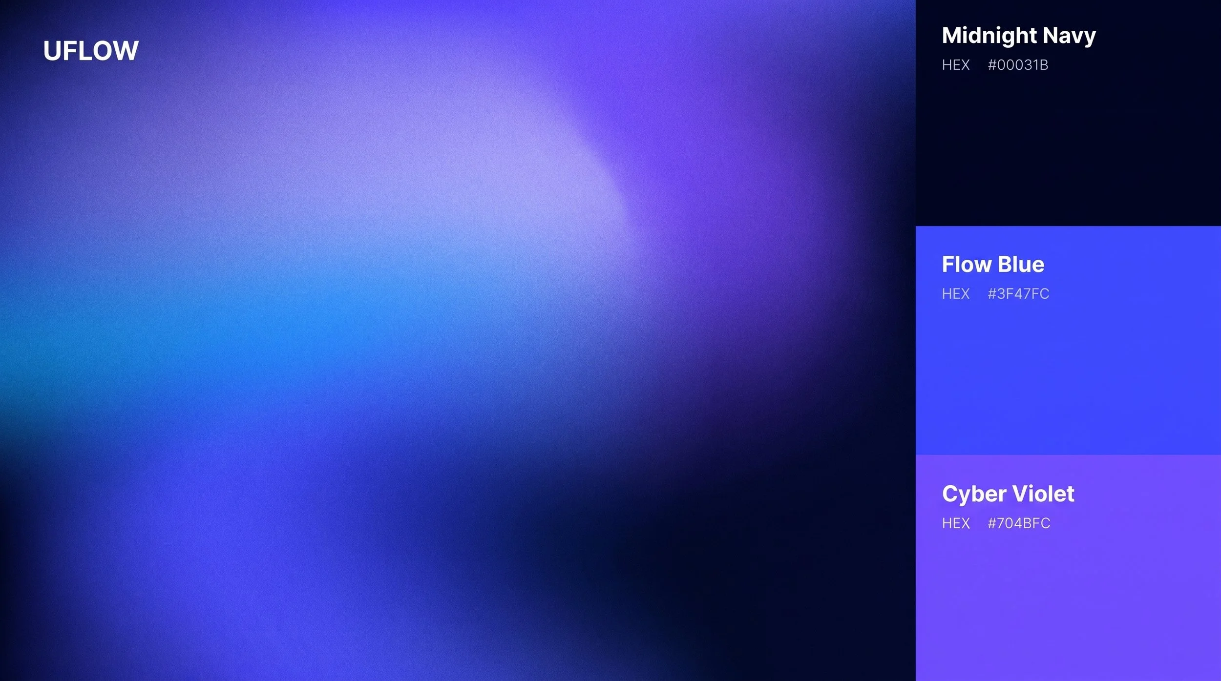
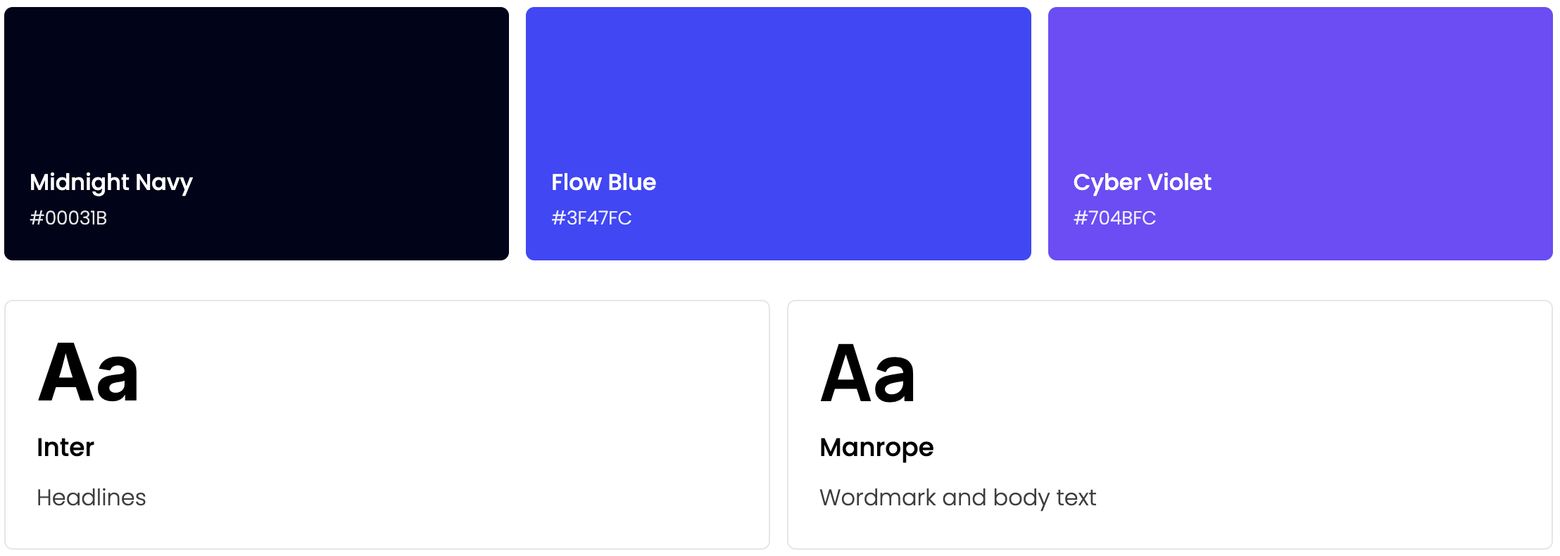
Midnight Navy is the ground. Flow Blue and Cyber Violet meet in a gradient that carries the idea of movement between screens. Inter sets the headlines; Manrope sets the wordmark and body text.
Navy holds, blue and violet move
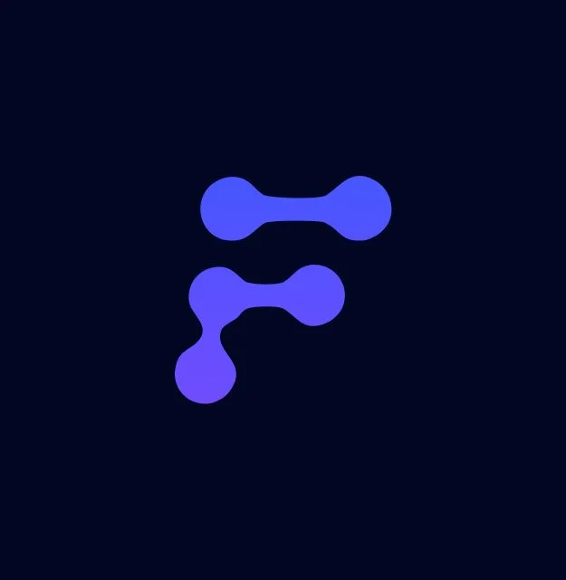
Five nodes, one path
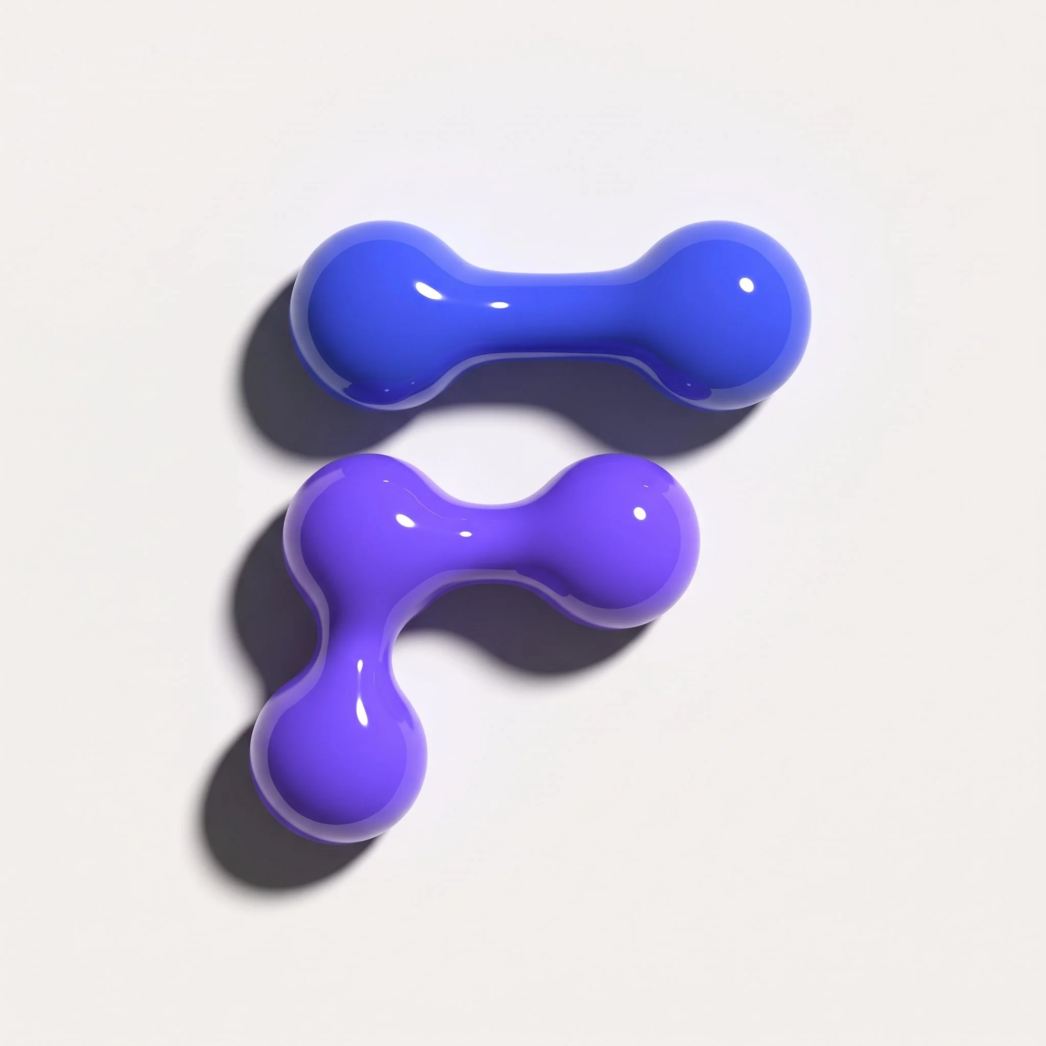
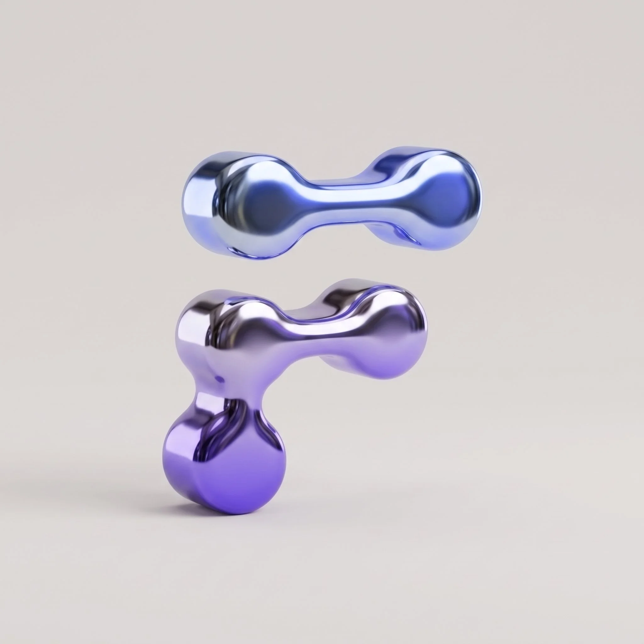
Screens become nodes and links become paths. Together they draw an F, for Flow, without drawing a flowchart. In the wordmark, a white U and a gradient Flow keep User + Flow visible in the name.
Exploring the symbol in 3D
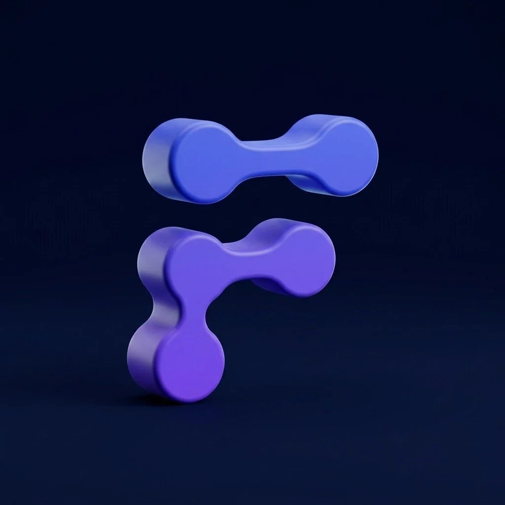
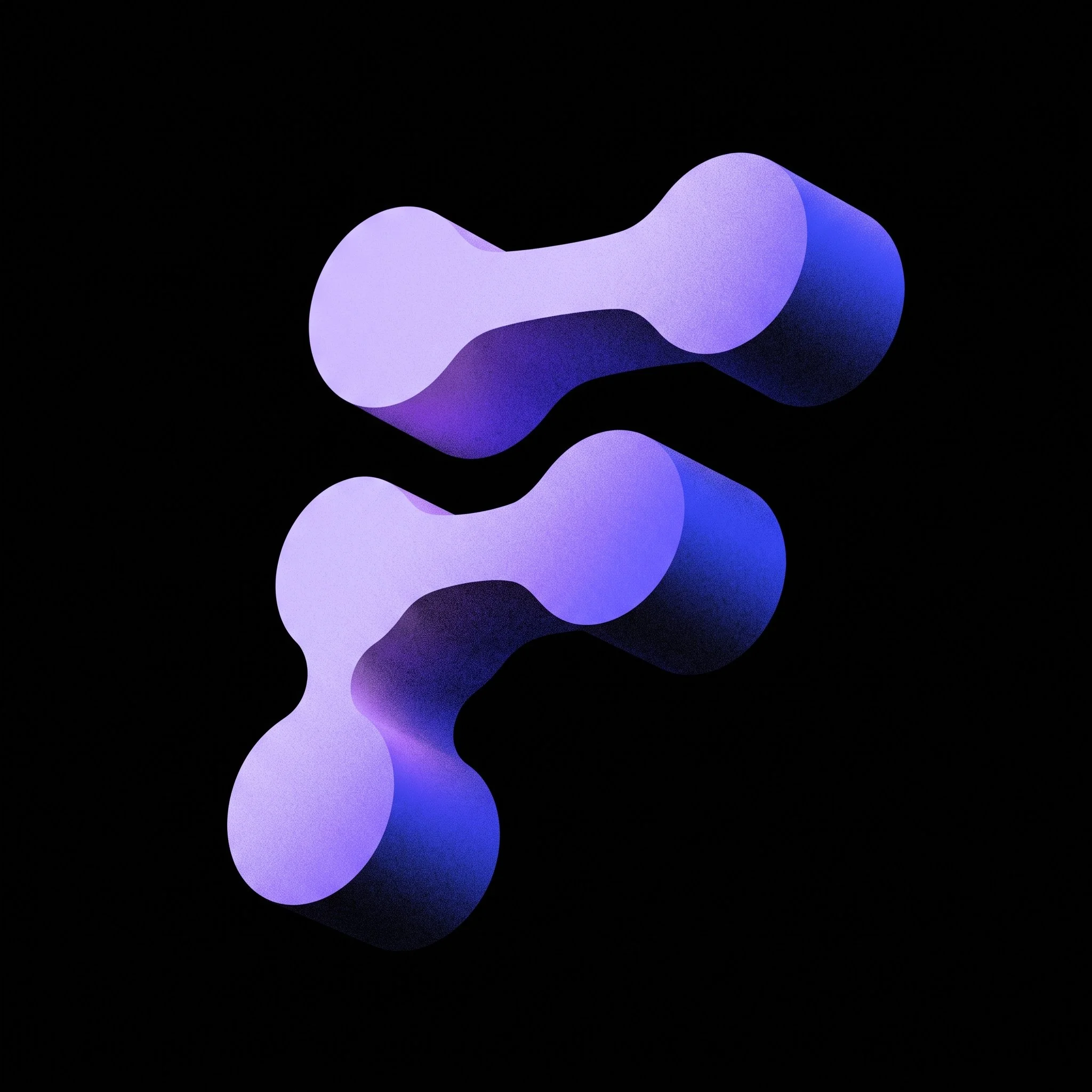
I tested the symbol in four materials: matte, grain, gloss and chrome. The question was the same each time: does the shape still read as five connected nodes when it gains volume?
The matte version then became an orbit animation, to see the symbol from every angle.
Patterns built from the symbol
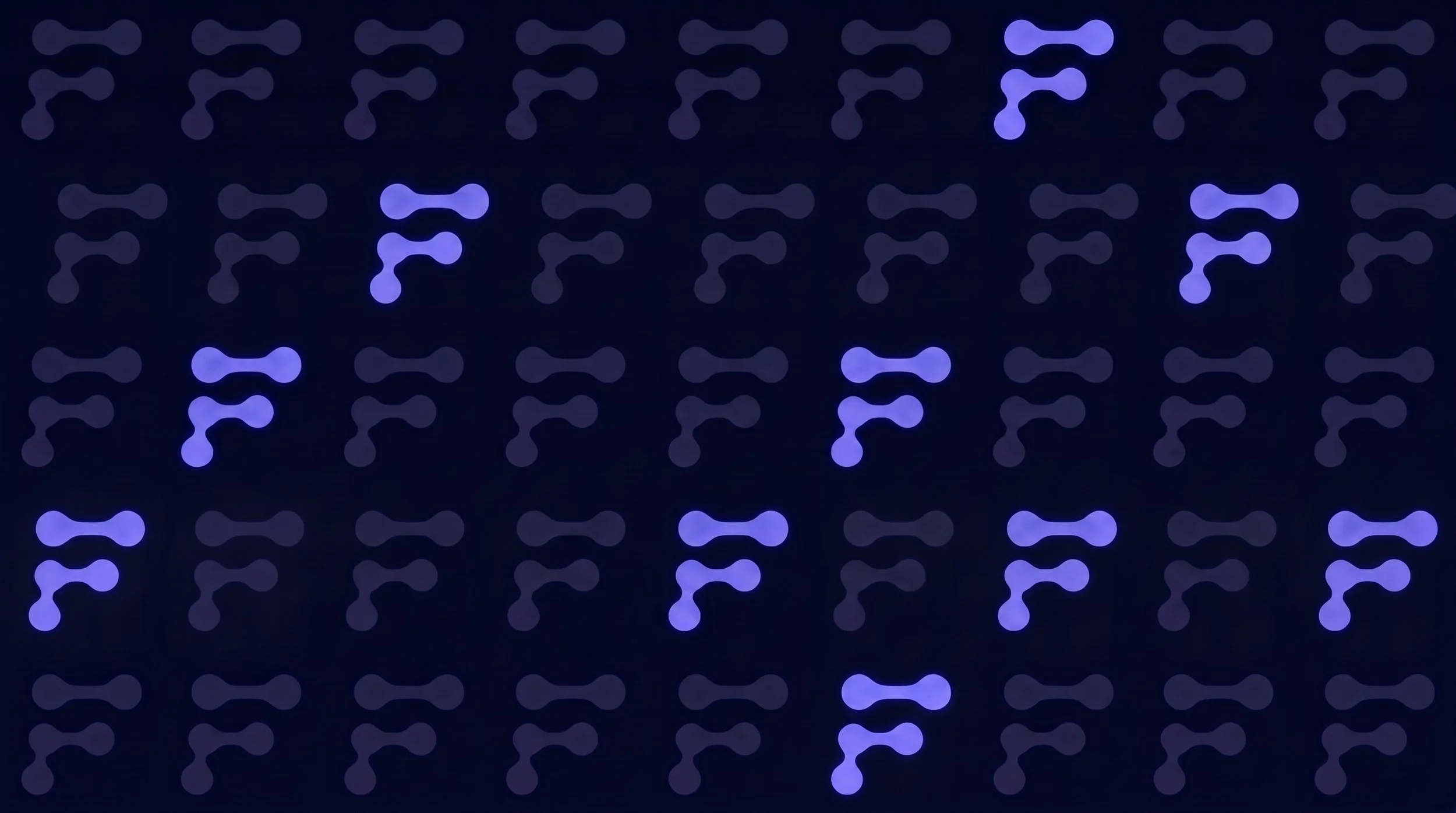
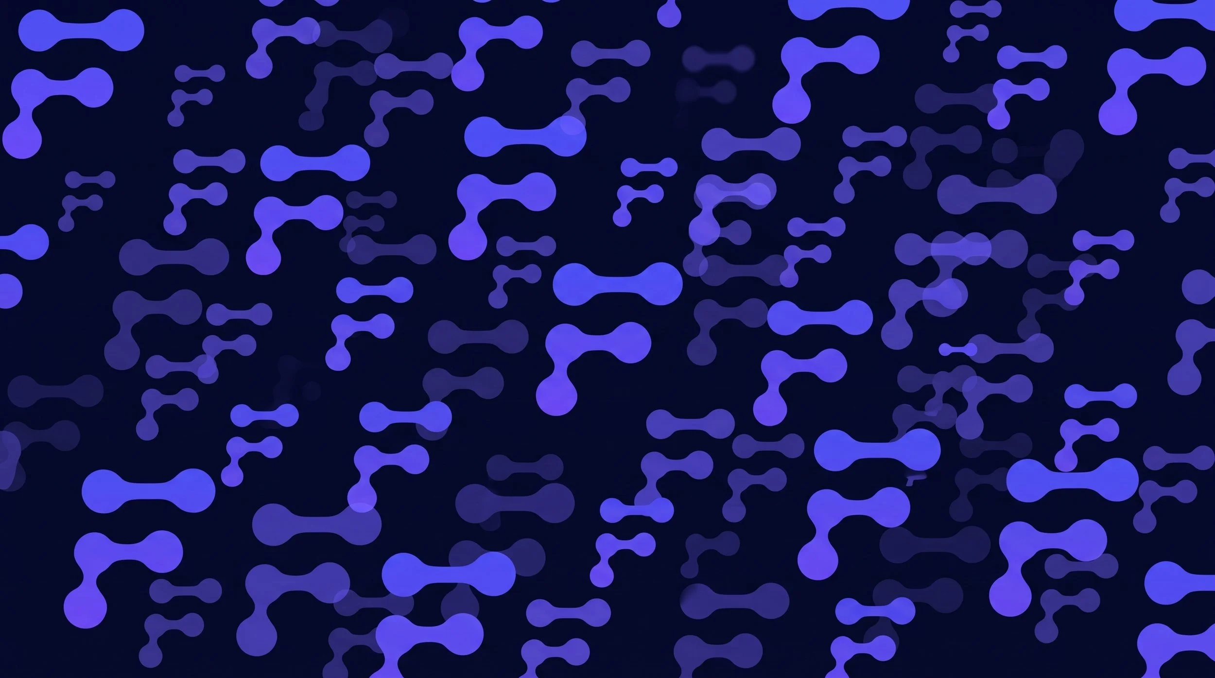
Repeated, the symbol becomes a pattern. In the highlight version a few nodes light up, like the active steps in a flow.
The voice lives in the interface
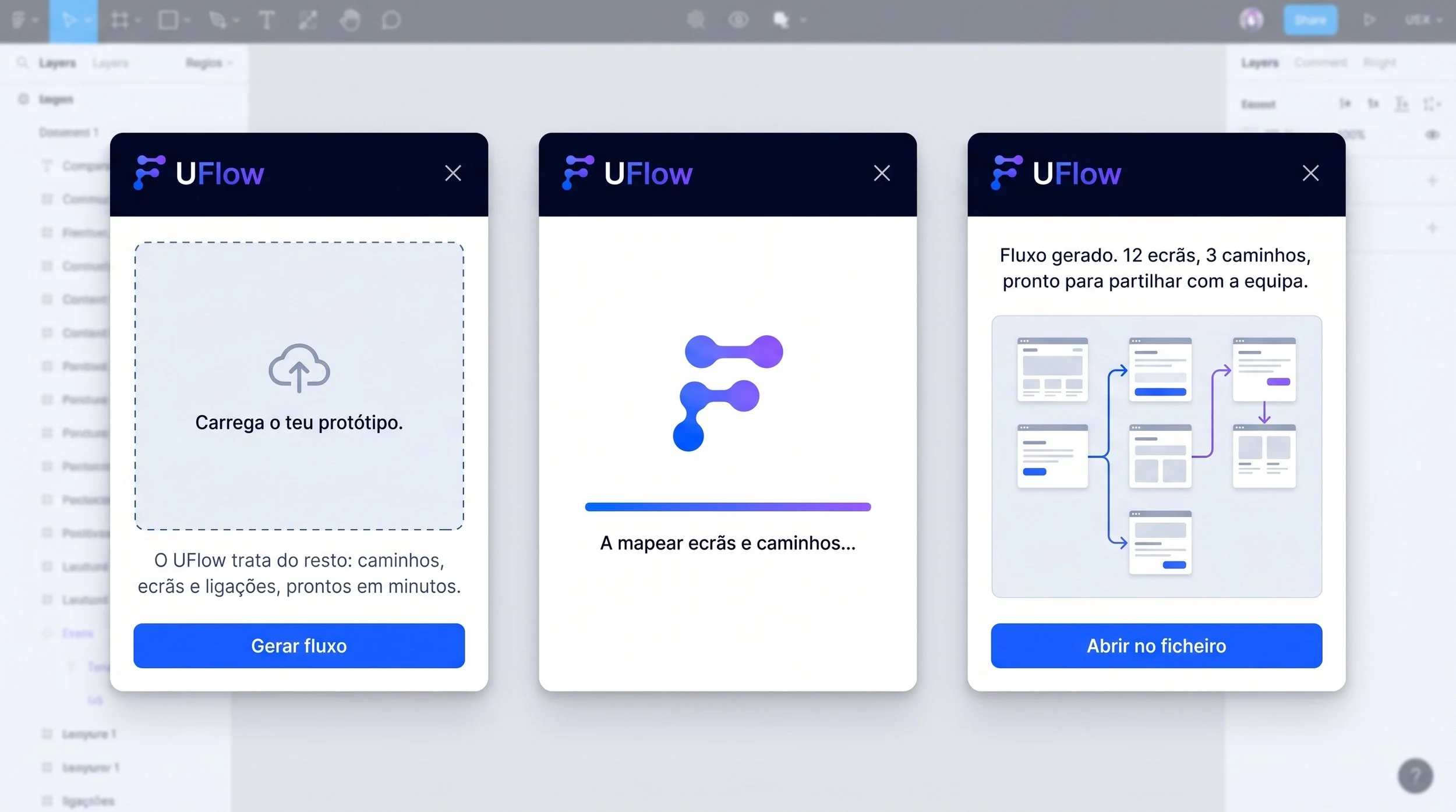
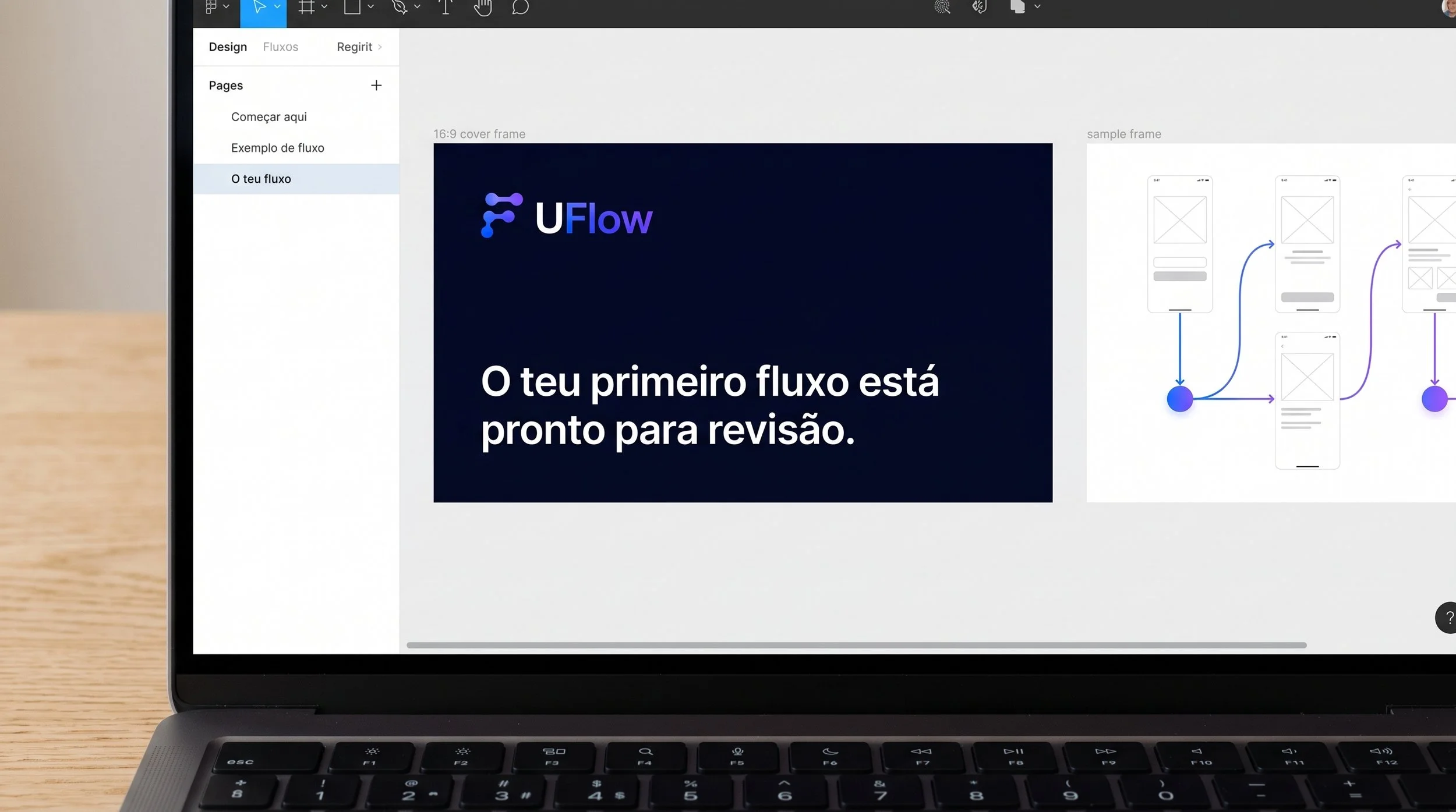
The plugin uses the voice manual's own copy: short, factual, with results you can count. "Flow generated. 12 screens, 3 paths."
The brand in use
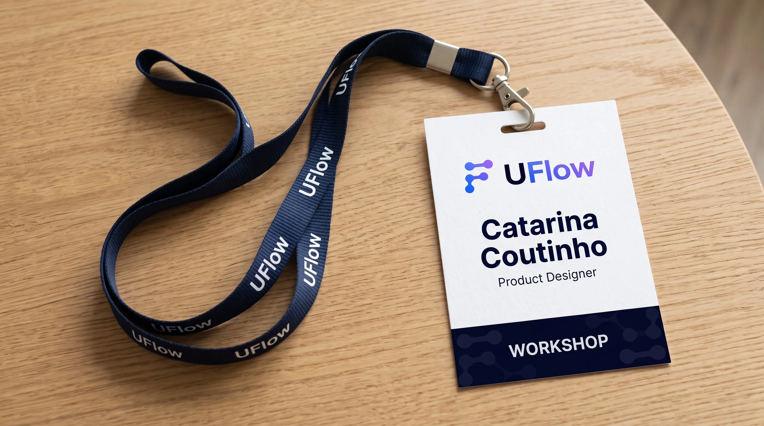
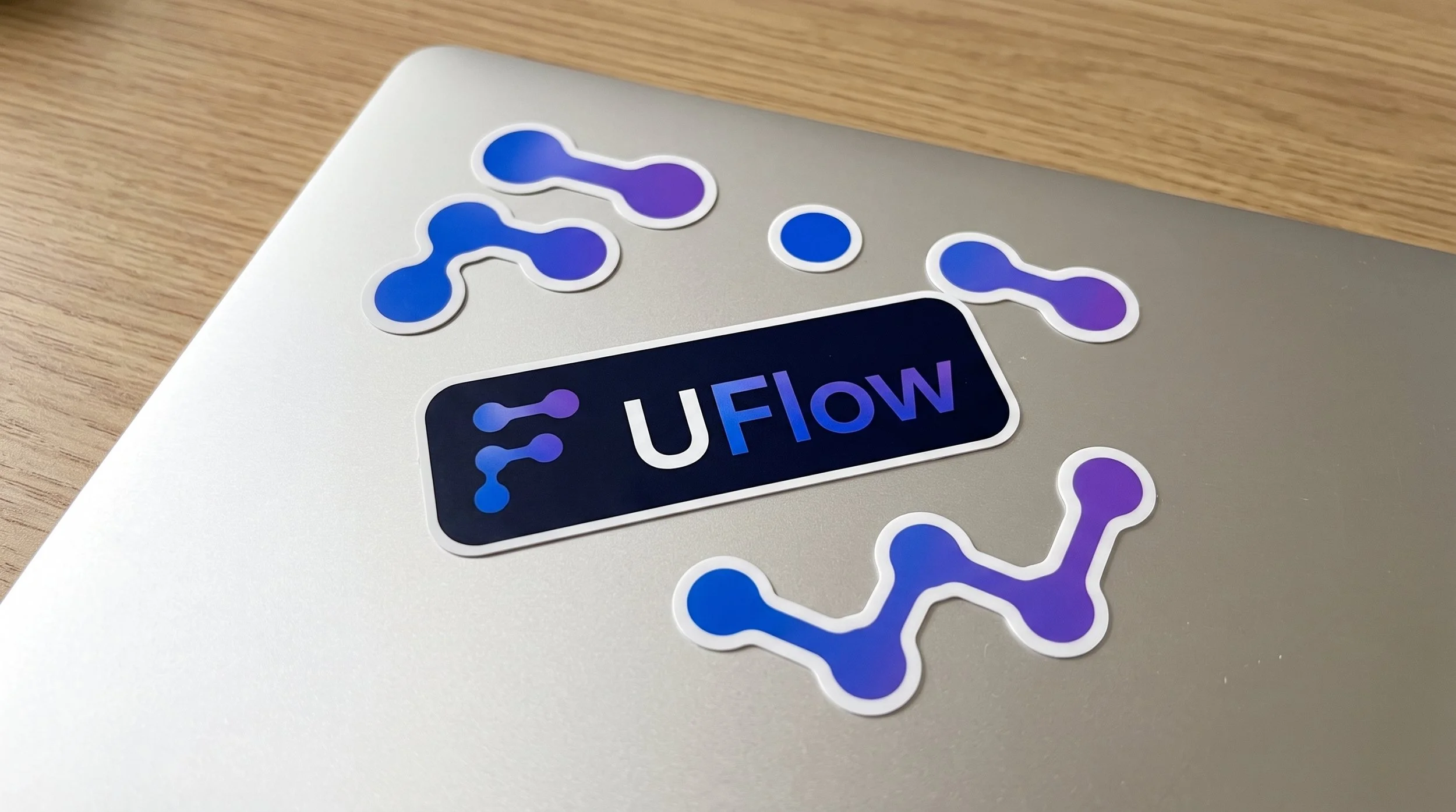
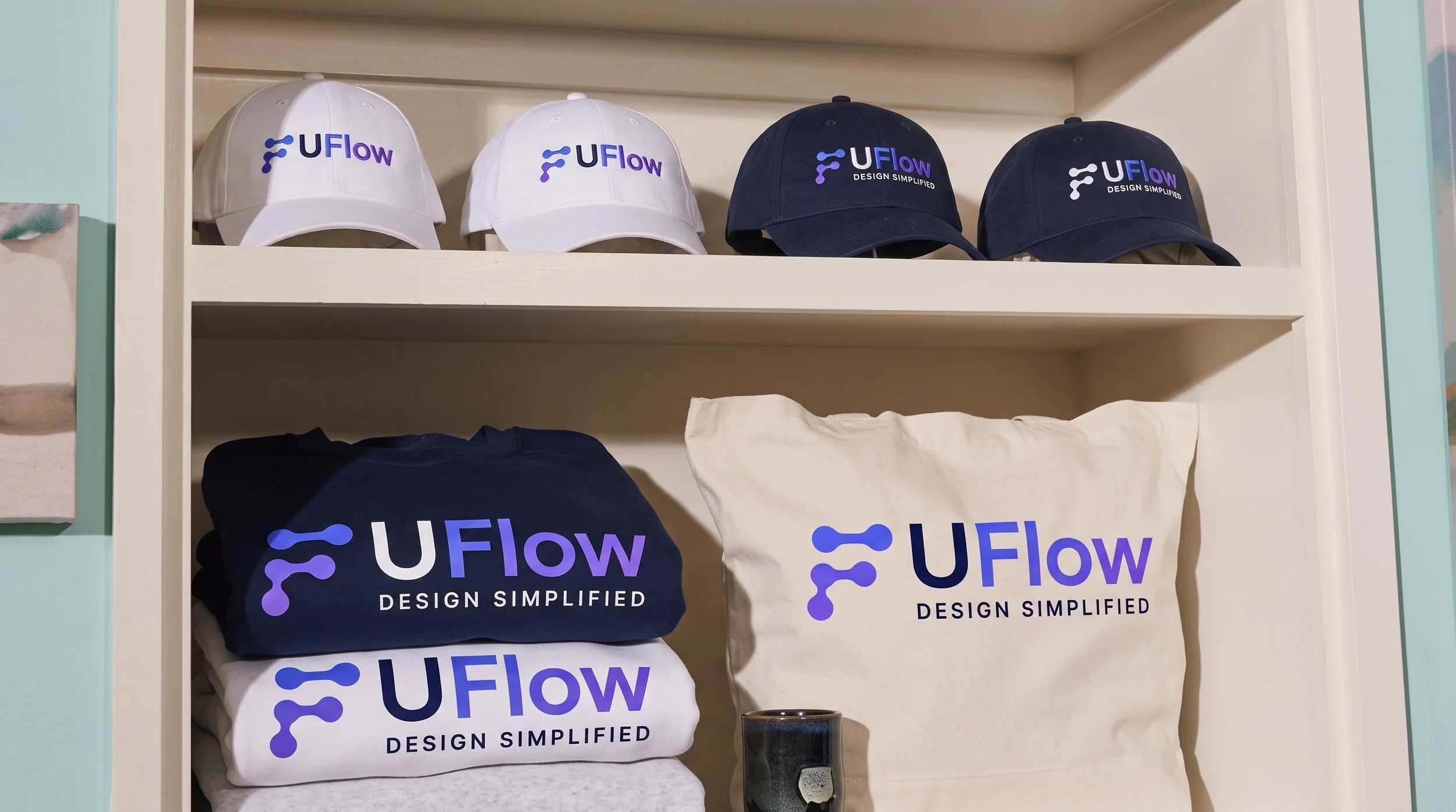
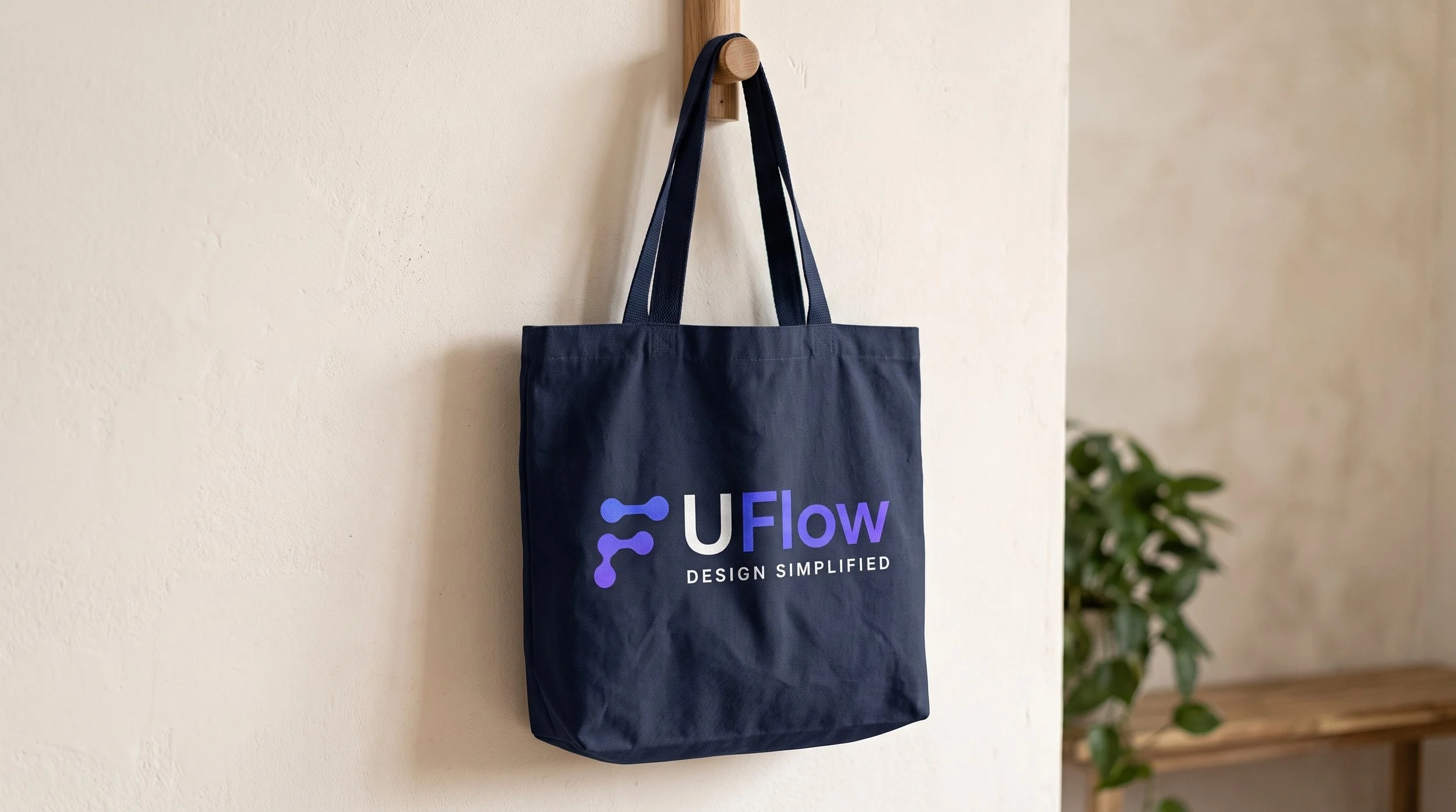
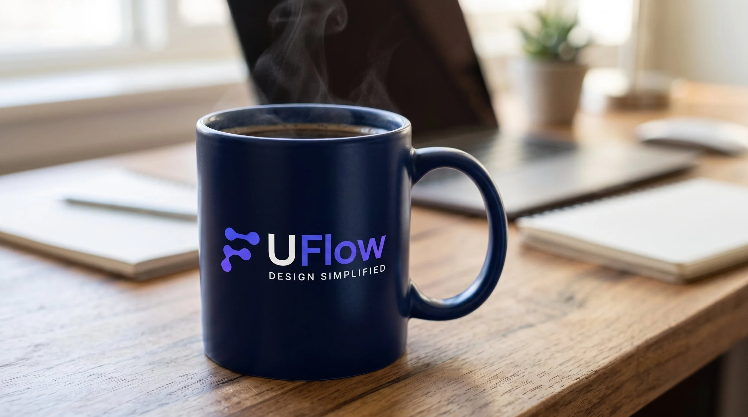
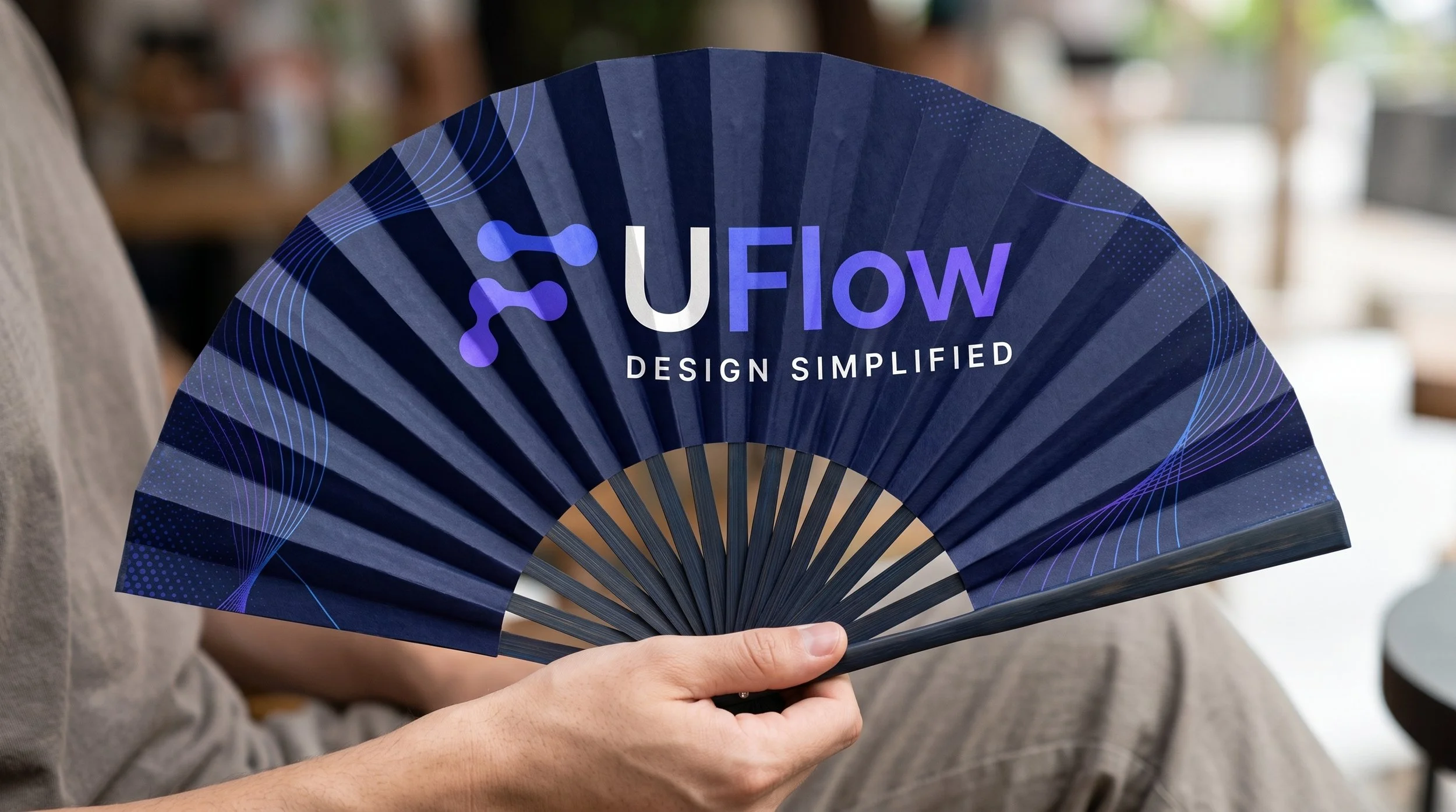
Badges, stickers and merchandise test the identity outside the screen, in positive and negative versions.
What I learned
AI widened the options. The strategy made the choices.
Strategy is the best prompt
Writing prompts from the brief tied every image back to a brand decision.
Generate wide, decide by hand
Eight logo directions came before one symbol was chosen.
Check everything AI adds
Mockups can carry distorted text and off-brand ideas. Not every output belongs in the brand.